Documentation
The three designs I’ll be critiquing are shown below. The idea of the app is a tool to allow people with disabilities to find love and/or friendship. This target user base for this app is only for people with disabilities and so my critiquing will be about making it the best user experience for those people.
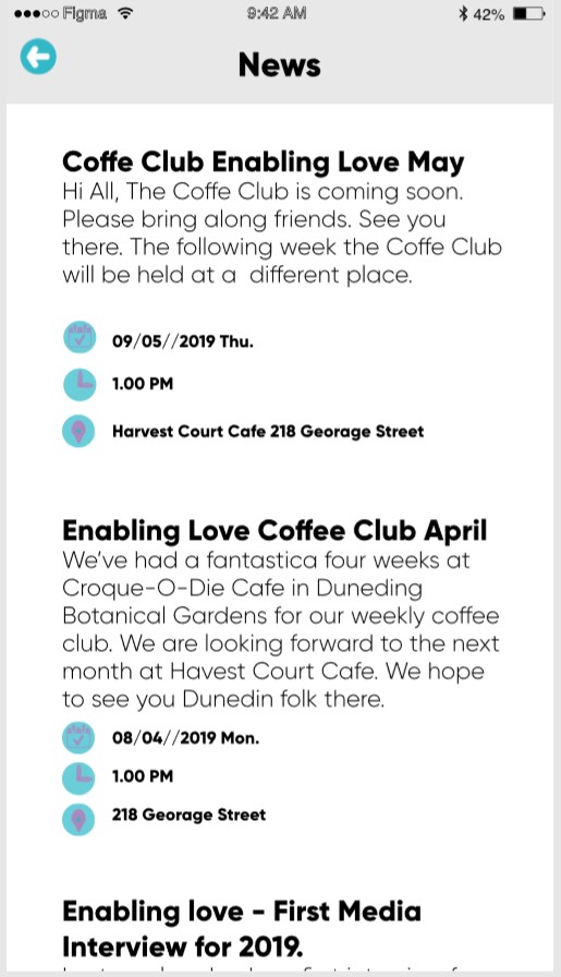
The first screen is the News feed. The news feed also contains meeting arrangements set up by the Enabling Love team. The overall look of this screen is simple. White background with black text, this is good as it’s neutral and easy on the eyes. The only problem with this page is the three small images to help indicate when and where a meeting will take place. Those images follow the same theme as the logo. Blue and purple. The problem with that is, purple and blue are both dark colours and don’t contrast nicely. It is not helped by how small those images are. Almost bullet point small. It would be okay for you and me, but for somebody that has colour blindness or some other similar vision impairment, it would be difficult. My proposed change would be to keep the design of the images but change the purple colour to white. This is following the new navigation bar found on the main screens.
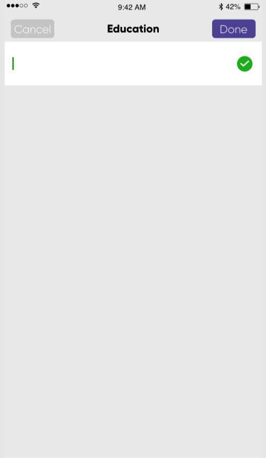
The next part of the app I’m critiquing is the part where you add your details to your profile. The image shown above is for adding your education. From a design point, I don’t like this because of all the unused space. I think the text box needs to be made bigger and some text or an image to fill out the screen. By explaining everything, even basic actions, it helps those who haven’t had much experience using smartphones and applications. Mobile phones are becoming increasingly larger with crazy screen to body ratios. This poses a problem for programmers because they must consider what’s shown at the top of the screen. You’ll notice that a lot of updated apps today have their navigation bars at the bottom, instead of using hamburger style menus and buttons at the top of the screen. The reason for that is, it makes it a lot easier for users to reach these parts of the display, especially with one hand. Smartphones are slowly becoming two-handed devices and to reach and tap content near the top of the display takes a lot of hand gymnastics or the use of your other hand. This ties into the design of this screen because the ‘Cancel’ and ‘Done’ buttons are located right at the top of the screen which looking at the target audience, could be proven to be bad design. This is only if the user tends to use their device one-handed.
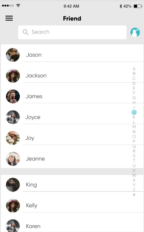
Lastly, I’ll be talking about how the bottom navigation bar and the friends screen. Following the principles talked about before, I’m glad that the design students went with the navigation bar at the bottom. Makes it nice and easy to reach with one hand, or two, with even the biggest of devices. The original design for these buttons was using the blue and purple theme which is used in the logo. They took the advice from the meetings we had with the client and made some good improvements. It’s a lot easier to distinguish between the pages and the images used are straight forward and easy to understand. The overall look of the friend’s page is good, nice simple design with a search function at the top. I do however think that the letter slider on the right of the screen should be moved to the bottom and should be a horizontal slider. The role of this slider is to quickly navigate to the group of friends whose first name begin with that letter you have scrolled on. This makes it a lot easier to find people on your friend’s list, rather than scrolling until you have found that person or typing in the search box. The problem I see with it is that it shares the same scrolling motion with just moving down the list. I have seen countless times people (Me included) want to just scroll down the list of people but accidentally scroll instead through the list of letters by accident. This is frustrating because I now have lost the place I was scrolling. I also think the lettering should be larger and easier to see.
Overall, in my opinion, the app design is okay. Although I think the way the app flows and the lack of many disability controls, makes this app look more for standard users without disabilities. I’d suggest adding more text and explanations in places or even have a tutorial shown before the start of each page when first downloaded. More care and attention need to be placed on the people that will be using the app. I do like the use of a simple colour scheme; the use of negative space is nice. Some apps can quite overwhelming, even for ‘typical’ users. From a technical standpoint, the app follows Googles material design language quite nicely by using flat images and colours with minimal shadows or 3D effects. It also follows the iOS theme as well. The slightly grey background combined with the white looks very familiar to iOS’s stock apps (Settings, messages, etc). As the development for the app continues, I will be trying to communicate with the client for potential design changes and tweaks to make sure that it meets their needs but also the needs of the disabled people that will be using it.