Nav bar design
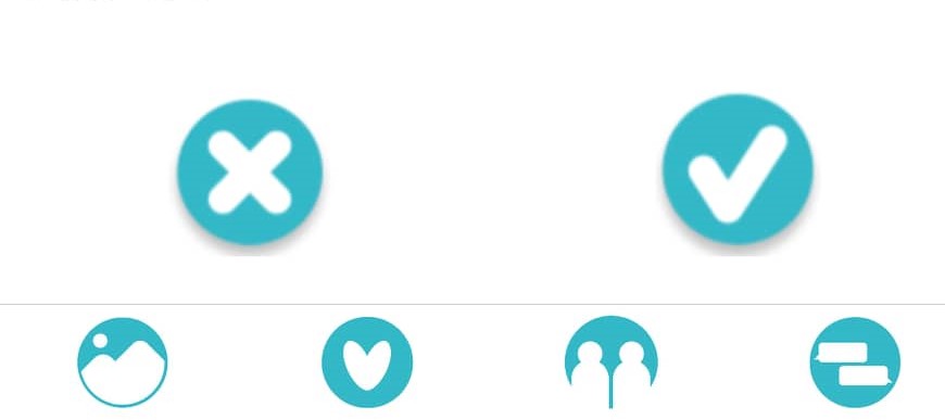
Adobe Photoshop was used to cut out the hi-res icons from the design students PDF document. All buttons that had an icon in them were carefully cut out and saved as PNG’s. These PNG’s were then used to replace the place holder images and text that’s in the navigation bar. The images were resized a little larger to match designs exactly. The the tick and cross icons were also placed into the swiping page. This meant moving and resizing the swiping cards so that the buttons would but also be big enough to see the users profile easy. The background colour of the nav bar is the same colour as the background of the app screens. This gives the app a modern feel and doesn’t make the user feel cramped in.
Navigation is done by creating stacks using the stack navigator which gives us the option to configure options for the screen. This is also where we call the images for the navigation bar.
