Start page design
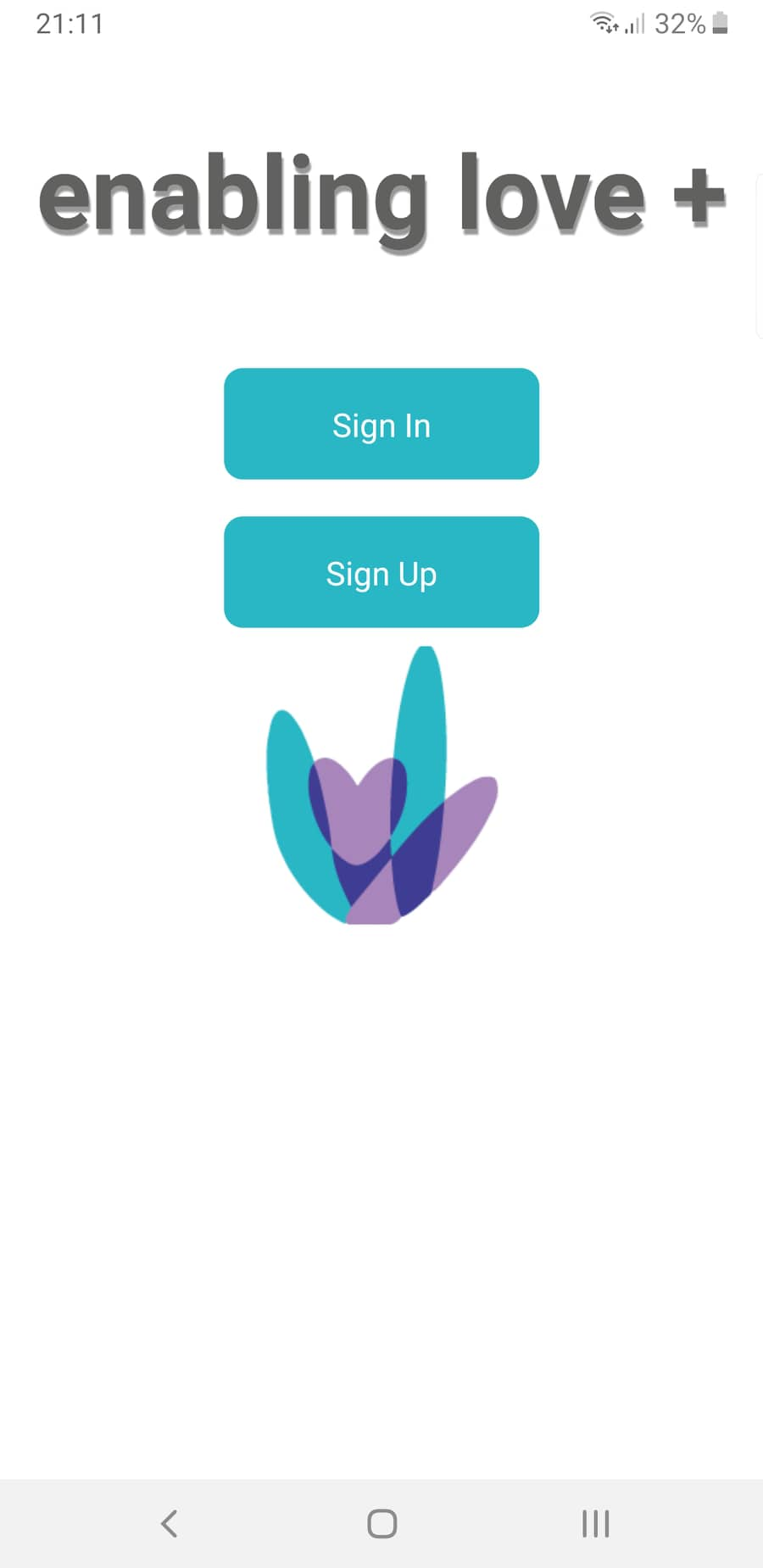
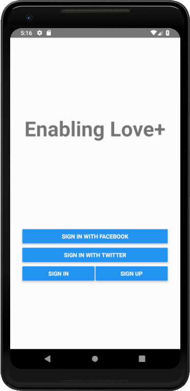
For the start page, I have decided to follow the same theme as the other designed pages. Blue buttons with the title and logo. The layout being, the title on top, followed by the buttons (Small) and finally the logo. Keeping the same theme throughout the app makes the app flow a lot nicer from page to page. Also by making all the clickable buttons a light blue, it becomes natural to assume that this design flows throughput the app. Due to the target audience of the app being less able, I have thought of simple ways of making the app really easy to use and navigate.
This is the old design
This is the new design